The prices of the stocks in the utility sector declined -3% last year compared to a rise of +13% for the S&P 500. Utilities were the only sector to decline in price last year, although energy stocks rose a meager +2% in 2012.
Still, in 2011, utilities were the best performing group, rising +15% during a year when the S&P wound up the year essentially unchanged.
Thus, over the past couple of years, the total return of the utility sector has outpaced the broader market average (+22% vs. +19% for the S&P 500).
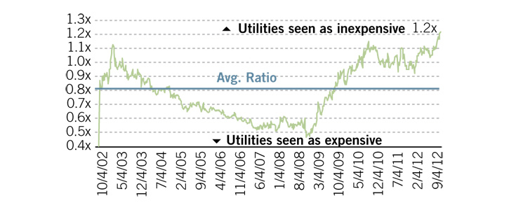
Utilities are at an interesting juncture at this point. Compared to bonds, the high dividend yields of utilities looks very attractive:
 |
| source: Fidelity Investments |
{Fidelity Utility Sector manager Doug} Simmons notes that in terms of price/earnings valuation, the utility sector is anything but a good deal at this juncture. Not only is the sector trading at a multiple well above its long-term average, Simmons points out that (as of the end of Sept.) the sector was trading at a 16% premium to U.S. large caps, when it’s long-term trend is to be in line with the big boys. The S&P 500 currently sells at an average p/e of 13.4.
ww.forbes.com/sites/ycharts/2012/11/19/if-you-must-be-in-utility-stocks-like-this-fidelity-guy-heres-what-you-do/
The problems with the group are several.
There is still excess capacity in the industry despite a slowing improving economy, and the pricing environment remains weak.
Allowed rates of return for regulated utilities are gradually moving lower, in line with general bond yields.
And utilities will be forced to increase their spend on meeting stricter environmental standards, especially those utilities that burn coal.
It is a time-honored technical standard that when the 50 day moving average price line crosses the 200-day moving average it is considered a "sell" signal. Technicians call this a "golden cross".
While I am not one to base investment decisions solely on technical factors, it is worth noting that the chart for the utility exchange traded fund (XLU) recently saw is first golden cross moment for the first time since the middle of 2008.
And, as the chart above shows, when the chart for XLU experienced a golden cross, the ETF proceeded to lose over -40% of its value in the next 8 months.
Now, to be sure, the market in general was in a free fall during the 2008-09 period, so perhaps the decline in utilities was overdone.
But still, it is worth noting that a group generally held for its defensive characteristics can turn decided negative.
No comments:
Post a Comment